When the Diamond Comes Cheap: A Critical Appraisal of the Nigerian 60th Anniversary Logo
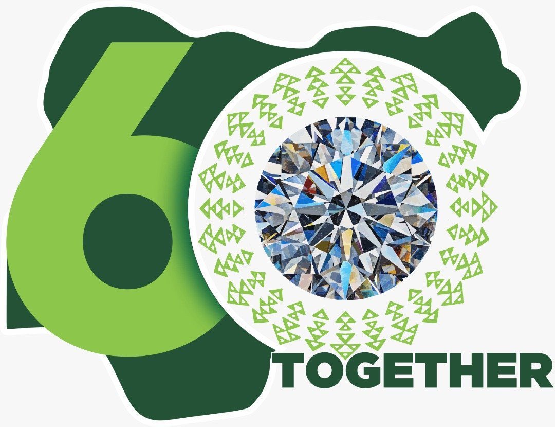
Three different shades of green, the number 60, a ‘Together’ wordmark, a 51 Carat Russian Dynasty diamond embroiled in trademark controversy; and you have all the elements used to represent Nigeria’s celebration of 60 years of independence. Make no mistake, my tone is not an indictment of this logo, neither is it an endorsement. I am yet to state my position. While I will after this review, here is a mere layman attempt at deconstructing the parts that make up a whole.
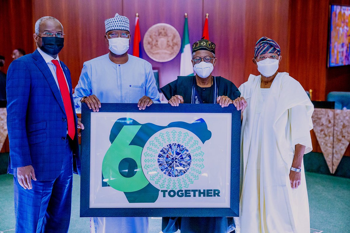
After its unveiling by the President on Wednesday, the 16th of September, 2020, there has been a torrential downpour of opinions from various quarters. Scathing remarks on social media, an ‘urging’ by the Federal Government for Nigerians to ‘embrace’ the visual icon, and a fistful of sarcastic neutrality that has dominated the headlines of major news outlets in response to the ensemble that is our nations 60th-anniversary logo.
However, rather than stand on a pedestal and decide on a position, I see it as a responsibility to attempt an objective critique of this logo from a design standpoint without pandering to public emotions or the visage of the political powers that be.
The Brief
‘’The challenge will include selecting the best slogan, the best poem and the best photograph that best embodies the theme “Together as one”. The best concepts from each category of the challenge will be selected by a mixture of several assessment criteria including a jury’’
The above, quoted from a website set up by the Nigerian government in an attempt to make the creation of this representative icon a challenge tries to detail what is expected of the design submissions.
The challenge will select what ‘best embodies the theme…’ and it’s selection criteria is a ‘mixture of several assessments’ and ‘a jury’. The fact that this vague juxtaposition of words is the closest to a clue about what one of the most important national icon of the year will look like, is in itself, a disgrace.
While some might think it is a challenge and the brief should not give too much away, it is also wise to understand that while a competition only requires each entrant to do better than the rest, an identity design of this degree clearly should be carried out at par with global best practices. The brief should have never been dictated by the nature of its process but by the gravity of its meaning. The end result of this ‘challenge’ was never finding a winner, it was finding a logo that speaks for a whole country of over 200 million people amongst which are an army of high achieving and well-experienced design professionals and firms.
The Design
The first process of design thinking is empathy – having a clear understanding and full immersion of self in the subject matter. Before even embarking on ideating, before you think about what the icon would look like, you must think of what the people it represents looks like, feels like, and think like. The cultural nuances and expressions cannot be left out as well. Empathy in design is a religion. It is a god all designers must serve if they want to create anything meaningful.
The independence of Nigeria is arguably the most important milestone in the nation’s history. While there is no single efficient way of conveying the significance of 1960 in single graphical imagery, the canvas has aeons of potential stories dying to be told. Instead, what is presented in this logo is a cold jumble of afterthoughts; unfeeling, unimpressive and starkly foreign.
The President in his rationale enthused;
“I’m informed that the selected option depicts our togetherness; a country of over 200 million people, whose natural talents, grits and passion glitter like the precious diamond we are,”
No!
What the logo depicts can be gleaned quite easily by taking her elements apart. There is a Nigeria Map, a superimposed ‘60′, a diamond and a ‘together’ wordmark. The obvious is a mutation that if converted to a phrase, literally reads; “Nigeria’s 60th Diamond Jubilee”. How sad!
Like the logo, this statement is another failed attempt at giving the logo a semblance of the people and nation it represents. Remove the wordmark and the logo fails to indicate any sort of ‘togetherness’. Even the logo’s patterns is a jumble of unconnected elements.
The president was informed that the logo depicts how Nigerians glitter like precious diamonds. Nigerians are going through one of the worst years of their lives. They have a declining economy, a fragmented democracy, insurgencies and poverty to deal with. Nigerians are definitely not glittering like any sort of diamond. In fact, it will not be too hard to imagine the scriptwriter being told ‘just find something to tie the diamond to togetherness and let’s run with it’.
The first process of design thinking is Empathy, and this logo failed, in glittering colours.
There’s really little need to delve into the abusive usage of the colour green, the font, the controversial diamond or the white background the whole thing is slapped on.
The Jury
Nigeria’s greatest asset is her human capital as the president noted in his speech. This pool of human resource boasts a myriad of creative minds who have been making an impact across the globe. What this logo presents is another chance to preach the potential of the country’s creativity after the below-par identity designed for the now-abandoned Nigeria Air Project. It is a logo of public interest and a symbol of national pride. If it will be a national challenge, it should have been selected by the best of the best. It should have been a campaign that produces hundreds of logos and art and photographs and poetry that celebrates Nigeria and expresses the thoughts of Nigerians. If it is a challenge, it should have been a platform for discovery. How a national challenge only has 15 entries to be chosen from is quite suspicious.
This logo should be a coalesce of our history, our challenges, our people and our ability. It is once in a year. It should wow. The form of its selection and the whole process of design is shady and uninspiring. The government needs to do better, the jury needed to have done better and the designer wasted a great opportunity for the showcase of Nigerian’s creative genius. This logo made a mockery of what we are capable of.
Three over ten!


